
Reimagining the
Onboarding Experience
Reducing friction and boosting retention for Trainline users through contextual guidance and human-centric design.
Context
The setup
About Trainline
Europe's leading rail and coach booking platform, operating across 45+ countries. Strong on feature delivery — but new user retention was underperforming, creating a gap between acquisition spend and actual activation.
Team
Product manager
Product designer
Lead engineer
2 iOS
2 Android
Role & Scope
I led discovery and end-to-end design for the onboarding redesign. I facilitated the stakeholder workshop that reframed the brief from "add more features" to "earn trust faster."
Problem
A Leaky Bucket
Despite delivering user-requested features, Trainline's retention metrics were slipping. New users were dropping off before they could experience the app's full value.

80% of new EU users dropped off before their second booking

33% of new visitors never re-engaged within 3 months
User Friction Points
Insight 2
Users felt the experience was "cold" and untailored, leading to a lack of trust in the platform.
Insight 1
"I'm liking the app, but the sign-in screens are annoying. I just want to buy a ticket."
What this told us
The friction wasn't functional — users could complete bookings. The gap was emotional. Trainline felt like a transaction engine, not a travel companion. Fixing retention meant fixing first impressions, not adding features.
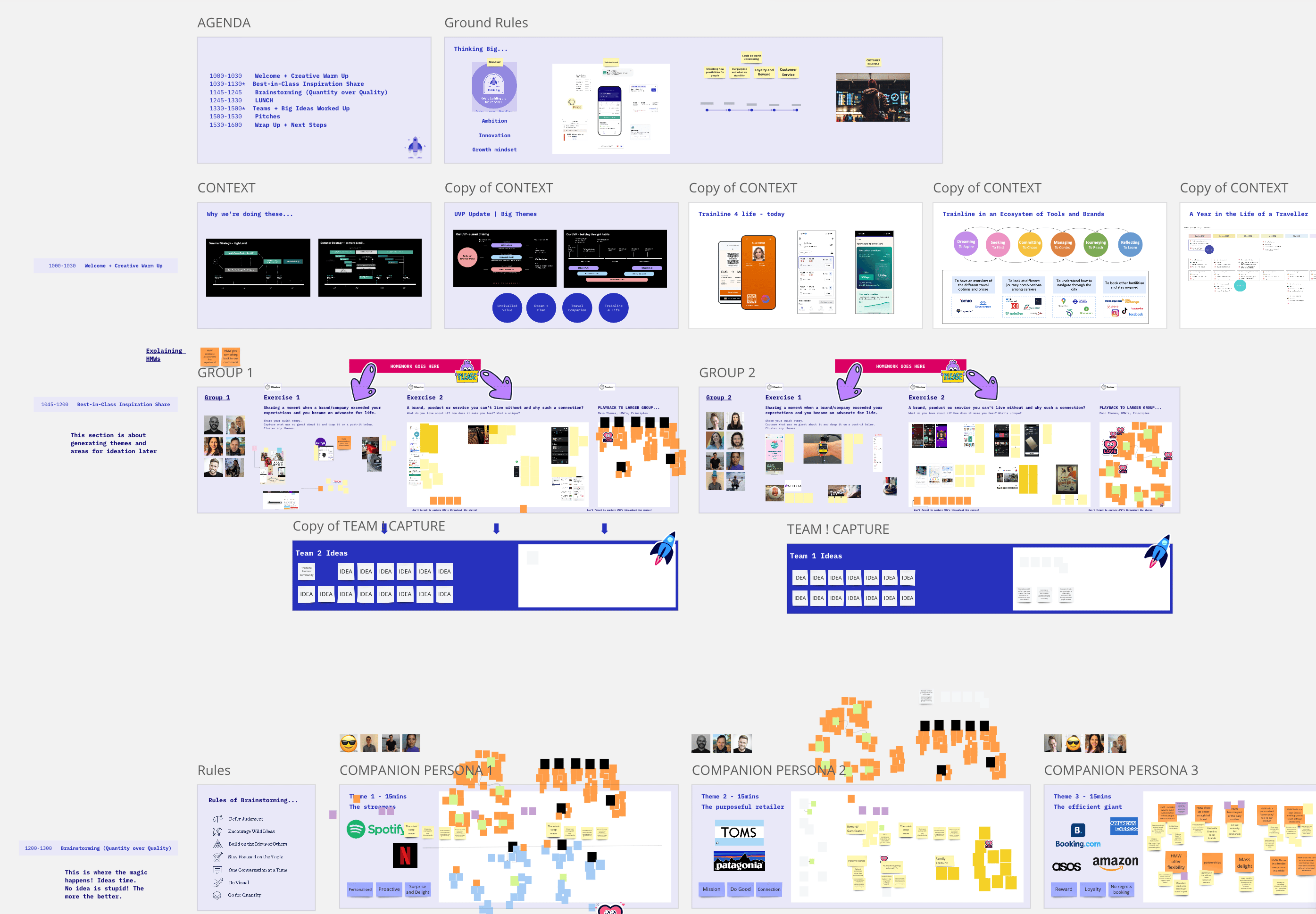
Discovery phase
Aligning on What Really Matters
To understand user needs and expectations and craft a process that uniquely defines Trainline as a company, we ran a discovery workshop with the relevant stakeholders.
From Confusion to Clarity

Cognitive Overload
of users encounter bugs/errors on the official provider site.

Context is King
struggle to find disruption info or platform numbers.

Strategic Friction
are uncertain about navigation at large hubs like Atocha.
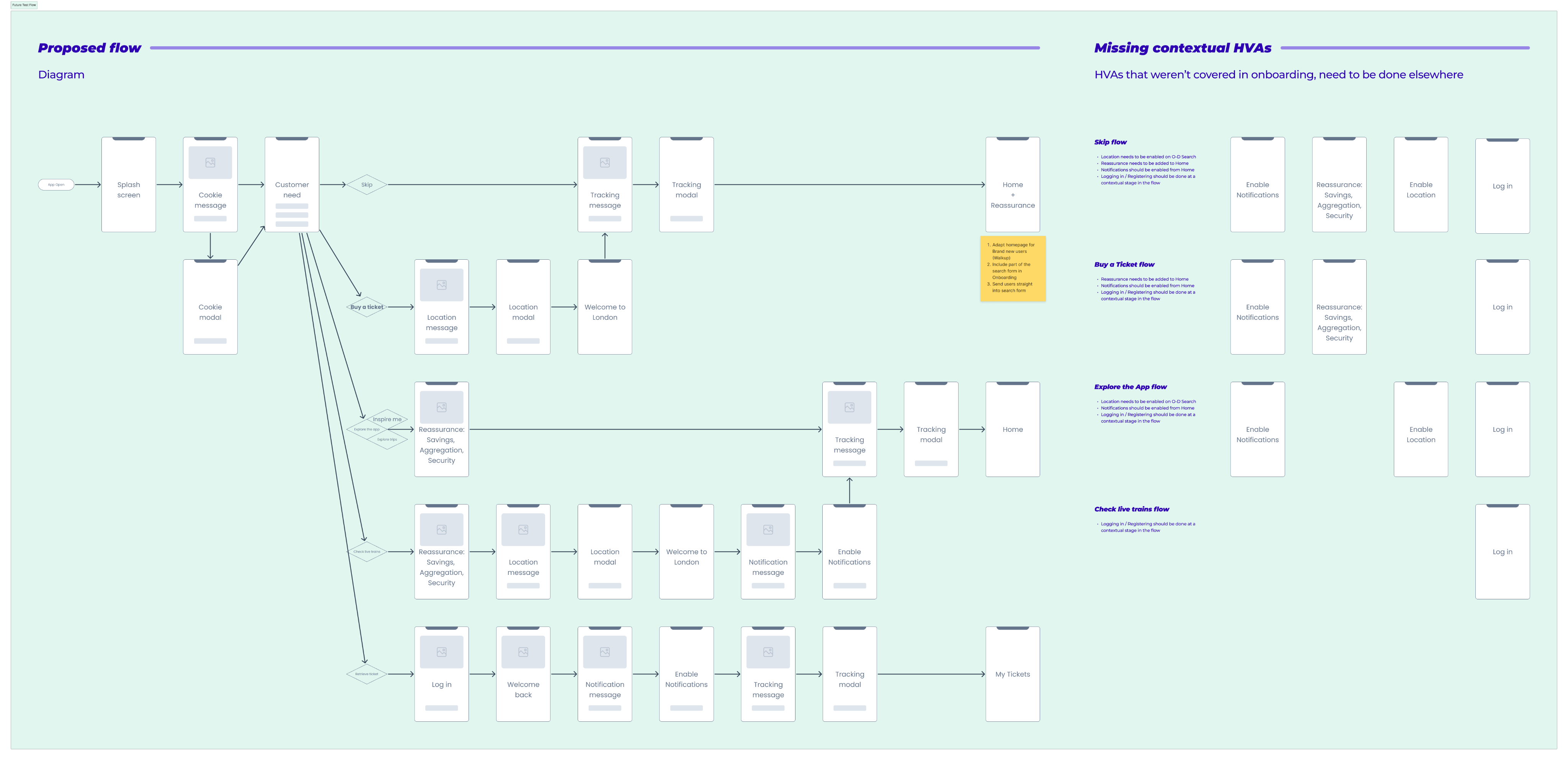
User flow
Linking heads with a low fidelity flow
solution
A Human-Centric Journey
Phase 1
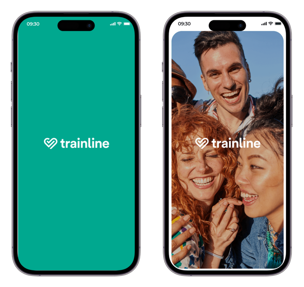
Emotional First Impressions
We replaced the generic loader with a branded splash screen. This subtle change softened the blow of system permissions (Tracking, Notifications) that follow immediately after.
"Bring delight into the app by aligning with brand campaigns."
Phase 2
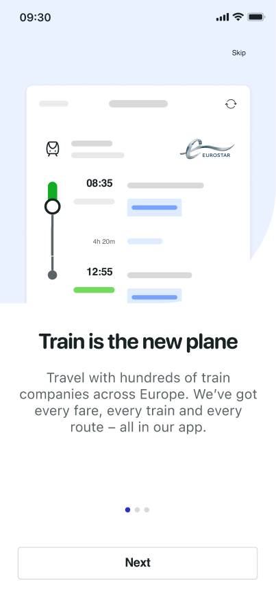
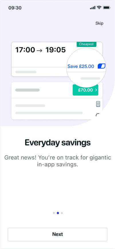
Value Prop Reassurance
We modernized the visuals and switched to friendly, "human" copy. Instead of dry functional descriptions, we focused on benefits: "Savings? We got 'em" and "No hassle, just travel."
Result:
0.09% CVR uplift in testing.
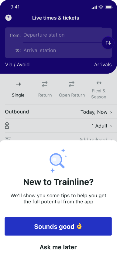
Phase 3
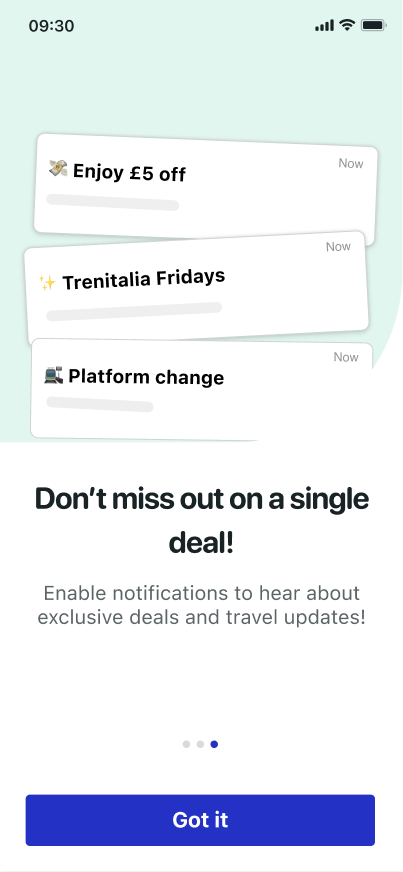
The "Coach Marks" Tour
Static tutorials are often skipped. We implemented contextual "Coach Marks"—tooltips that overlay the live interface to point out complex features like the Price Calendar only when relevant.
Targeted to first-time users only
Increased feature discovery by 22%

Promos

Check in here available promos, we are finding them for you

Okay


Railcards and Loyalty cards
Make sure to enter your discount cards to collect points with your bookings.


Next


Get Started
Useful tips to book smarter with Trainline

Cheapest prices

Use our week calendar to see the cheapest price for each day.

Next

Impact & Reflection
Measurable Impact
+13%
Retention Uplift
M2 Retention increased significantly, proving that educated users stick around longer.
42%

66%
CSAT Score
User satisfaction for the onboarding flow skyrocketed after the "human" copy updates.
Reflection & Next Steps
This project taught me that onboarding is not a "set it and forget it" feature. It's a relationship builder. If I were to continue, I would focus on Deep Linking —customizing the welcome screen based on whether the user came from a "Cheap Tickets" ad or a generic search.


Reimagining the
Onboarding Experience
Reducing friction and boosting retention for Trainline users through contextual guidance and human-centric design.
Context
The setup
About Trainline
Europe's leading rail and coach booking platform, operating across 45+ countries. Strong on feature delivery — but new user retention was underperforming, creating a gap between acquisition spend and actual activation.
Team
Product manager
Product designer
Lead engineer
2 iOS
2 Android
Role & Scope
I led discovery and end-to-end design for the onboarding redesign. I facilitated the stakeholder workshop that reframed the brief from "add more features" to "earn trust faster."
Problem
A Leaky Bucket
Despite delivering user-requested features, Trainline's retention metrics were slipping. New users were dropping off before they could experience the app's full value.
80% of new EU users dropped off before their second booking
33% of new visitors never re-engaged within 3 months
User Friction Points
Insight 2
Users felt the experience was "cold" and untailored, leading to a lack of trust in the platform.
Insight 1
"I'm liking the app, but the sign-in screens are annoying. I just want to buy a ticket."
What this told us
The friction wasn't functional — users could complete bookings. The gap was emotional. Trainline felt like a transaction engine, not a travel companion. Fixing retention meant fixing first impressions, not adding features.
Discovery phase
Aligning on What Really Matters
To understand user needs and expectations and craft a process that uniquely defines Trainline as a company, we ran a discovery workshop with the relevant stakeholders.
From Confusion to Clarity
Cognitive Overload
of users encounter bugs/errors on the official provider site.
Context is King
struggle to find disruption info or platform numbers.
Strategic Friction
are uncertain about navigation at large hubs like Atocha.
User flow
Linking heads with a low fidelity flow
solution
A Human-Centric Journey
Phase 1
Emotional First Impressions
We replaced the generic loader with a branded splash screen. This subtle change softened the blow of system permissions (Tracking, Notifications) that follow immediately after.
"Bring delight into the app by aligning with brand campaigns."
Phase 2
Value Prop Reassurance
We modernized the visuals and switched to friendly, "human" copy. Instead of dry functional descriptions, we focused on benefits: "Savings? We got 'em" and "No hassle, just travel."
Result:
0.09% CVR uplift in testing.
Phase 3
The "Coach Marks" Tour
Static tutorials are often skipped. We implemented contextual "Coach Marks"—tooltips that overlay the live interface to point out complex features like the Price Calendar only when relevant.
Targeted to first-time users only
Increased feature discovery by 22%
Promos
Check in here available promos, we are finding them for you
Okay

Railcards and Loyalty cards
Make sure to enter your discount cards to collect points with your bookings.
Next

Get Started
Useful tips to book smarter with Trainline
Cheapest prices
Use our week calendar to see the cheapest price for each day.
Next
Impact & Reflection
Measurable Impact
+13%
Retention Uplift
M2 Retention increased significantly, proving that educated users stick around longer.
42%

66%
CSAT Score
User satisfaction for the onboarding flow skyrocketed after the "human" copy updates.
Reflection & Next Steps
This project taught me that onboarding is not a "set it and forget it" feature. It's a relationship builder. If I were to continue, I would focus on Deep Linking —customizing the welcome screen based on whether the user came from a "Cheap Tickets" ad or a generic search.

Reimagining the
Onboarding Experience
Reducing friction and boosting retention for Trainline users through contextual guidance and human-centric design.
Context
The setup
About Trainline
Europe's leading rail and coach booking platform, operating across 45+ countries. Strong on feature delivery — but new user retention was underperforming, creating a gap between acquisition spend and actual activation.
Team
Product manager
Product designer
Lead engineer
2 iOS
2 Android
Role & Scope
I led discovery and end-to-end design for the onboarding redesign. I facilitated the stakeholder workshop that reframed the brief from "add more features" to "earn trust faster."
Problem
A Leaky Bucket
Despite delivering user-requested features, Trainline's retention metrics were slipping. New users were dropping off before they could experience the app's full value.
80% of new EU users dropped off before their second booking
33% of new visitors never re-engaged within 3 months
User Friction Points
Insight 2
Users felt the experience was "cold" and untailored, leading to a lack of trust in the platform.
Insight 1
"I'm liking the app, but the sign-in screens are annoying. I just want to buy a ticket."
What this told us
The friction wasn't functional — users could complete bookings. The gap was emotional. Trainline felt like a transaction engine, not a travel companion. Fixing retention meant fixing first impressions, not adding features.
Discovery phase
Aligning on What Really Matters
To understand user needs and expectations and craft a process that uniquely defines Trainline as a company, we ran a discovery workshop with the relevant stakeholders.
From Confusion to Clarity
Cognitive Overload
of users encounter bugs/errors on the official provider site.
Context is King
struggle to find disruption info or platform numbers.
Strategic Friction
are uncertain about navigation at large hubs like Atocha.
User flow
Linking heads with a low fidelity flow
solution
A Human-Centric Journey
Phase 1
Emotional First Impressions
We replaced the generic loader with a branded splash screen. This subtle change softened the blow of system permissions (Tracking, Notifications) that follow immediately after.
"Bring delight into the app by aligning with brand campaigns."
Phase 2
Value Prop Reassurance
We modernized the visuals and switched to friendly, "human" copy. Instead of dry functional descriptions, we focused on benefits: "Savings? We got 'em" and "No hassle, just travel."
Result:
0.09% CVR uplift in testing.

Promos

Check in here available promos, we are finding them for you

Okay


Railcards and Loyalty cards
Make sure to enter your discount cards to collect points with your bookings.


Next


Get Started
Useful tips to book smarter with Trainline

Cheapest prices

Use our week calendar to see the cheapest price for each day.

Next

Phase 3
The "Coach Marks" Tour
Static tutorials are often skipped. We implemented contextual "Coach Marks"—tooltips that overlay the live interface to point out complex features like the Price Calendar only when relevant.
Targeted to first-time users only
Increased feature discovery by 22%
Impact & Reflection
Measurable Impact
+13%
Retention Uplift
M2 Retention increased significantly, proving that educated users stick around longer.
42%
66%
CSAT Score
User satisfaction for the onboarding flow skyrocketed after the "human" copy updates.
Reflection & Next Steps
This project taught me that onboarding is not a "set it and forget it" feature. It's a relationship builder. If I were to continue, I would focus on Deep Linking —customizing the welcome screen based on whether the user came from a "Cheap Tickets" ad or a generic search.

